Lets be honest. Sign up forms suck.
As designers we often get carried away with how a sign up form looks and forget about the user experience. Border here, rounded corners there, maybe a hint of shadow…
Truth is users don’t care about how it looks. They care about getting through the form as quickly as possible. They care about what information you’re asking for and why you need it. They care about getting access to your website or app so they can start using it.
What's the minimum amount of data you need to let someone in?
Ask yourself “Do I need to know this right now?”
Email address
The one thing you need to create an account is most likely an email address.
Everyone online has at least one email address so this is the perfect way to identify someone using your app and when you have their email you can contact them, send them setup details, keep them up-to-date.
Password
You more than likely need a password as well to let users into your app.
That said you can always email them a password then let them change it later, for the sake of giving them even quicker access.
It’s debatable whether you need a field to confirm the user’s password or not.
Username
If your app involves some sort of public profile, you’ll need a username that will identify the person. This username can then be used for login, as well as their email.
What you (probably) don't need to know "right now"
- Date of birth
- Zip/post code
- Gender of the user
- First name
- Last name
All these are extra fields that will potentially scare your user away.
I don’t know what the stats are but I guarantee sign up forms that have these required fields end up getting a good lot of Joe Bloggs, born on 1st January from Beverly Hills 90210. Why? Because users just want quick access and they’ll enter the first thing that comes to mind that doesn’t lead back to them.
Gradual engagement
I’ve been reading Web Form Design: Filling In The Blanks, where Luke Wroblewski talks about gradual engagement.
Lets look at this process.
Sign up process 1: Facebook
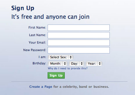
- I'm presented with this form. This is enough to turn me away as there are quite a few fields.
- After submitting these details I have to complete a captcha for anti-spam.
- I successfully sign up but an activation link has been sent to my email and I need to verify. I have to leave the site now to check my mail.
- Verification email link clicked. Thankfully this wasn't delayed or marked as spam.
- I'm in. Now to complete the process, find friends etc.
See how many annoying things happened here. The thing is though, Facebook can get away with it. Your website can’t. If this was another site and Facebook wasn’t one of the biggest sites on the planet, you probably would have walked away by now.
Sign up process 2: Twitter
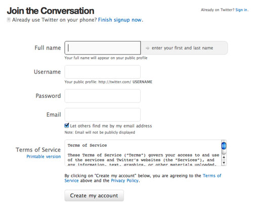
- Sign up - pretty good, bit more fields than I would like but satisfactory.
- After submitting details I'm presented with a captcha for anti-spam.
- Now I'm in and I can start using it.
Twitter definitely has a nicer sign up process than Facebook. They also sent me an activation email but notice how Twitter lets you into their app (with limited access) before you have to click the activation link. Good job.
Sign up process 3: Geni
Geni is a family tree web app and has a very interesting sign up process:
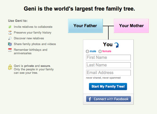
- You don't sign up, you just start making your family tree.
Geni has a form on the homepage that records your email address, which is all they need to setup your account, but it’s cleverly disguised as part of the application so I never really sign up. Instead I’m jumping straight in and using the service.
Behind the scenes Geni has emailed be a temporary password to use until I create my own.
This is gradual engagement. I’m able to start using the service without actually signing up. I’m happy as there’s no time wasted. They’re happy as they have another user using their service.
Conclusion
Try to get the user involved first before asking them to sign up, then only ask for the information you really need.
If you need email confirmation (to prevent spam accounts) let the user continue to use your website in the mean time. Maybe close the account after a week or a month if they still haven’t verified, or restrict access to certain parts of your app.
Don’t scare users away with many fields. Often zip codes, DOB, even names can come later. Let them in fast.
For handiness make use of Twitter oAuth, Facebook Connect and OpenID etc. so users can sign in with 3rd party tools.
Further reading
This blog post is based on my own interpretation of a chapter of Web Form Design: Filling In The Blanks.
I highly recommend this book if you’re a UI designer as you undoubtedly work with forms daily. If you’re interested in usability, eye fixations, error prevention, web apps etc. then you should read this book.
- WebFinger - a protocol that lets users sign into a site using just their email address
- Sign up forms must die - a more in depth look at gradual engagement
What annoys you most about sign up forms? Have you tried gradual engagement?
Receive more design content like this to your inbox
I promise not to spam you. No more than one email per week.